Year:
2025
Industry:
Healthcare
Company:
Patchwork Health
Methods:
Mixed-method user research
Persona development
Workshop facilitation
User experience
UI design
Overview
Patchwork is a healthcare workforce platform used by NHS trusts to manage clinical staffing. At the centre of the product is the roster view, which teams rely on daily to plan shifts, manage leave, and maintain department-level coverage.
This project was about rebuilding that experience from the ground up. The goal was to enable multi-week planning, support cross-department workflows, meet NHS tender requirements, and unblock multiple go-lives that had stalled due to critical usability gaps.
The challenge
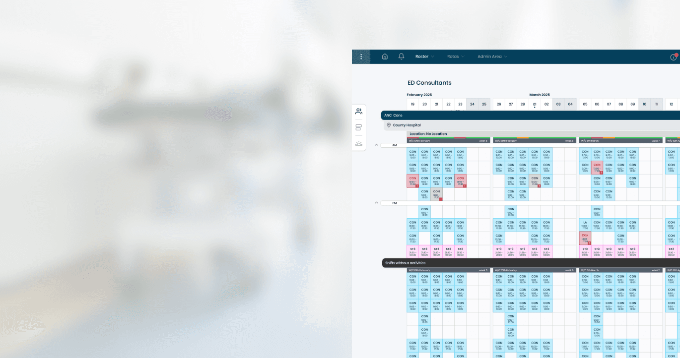
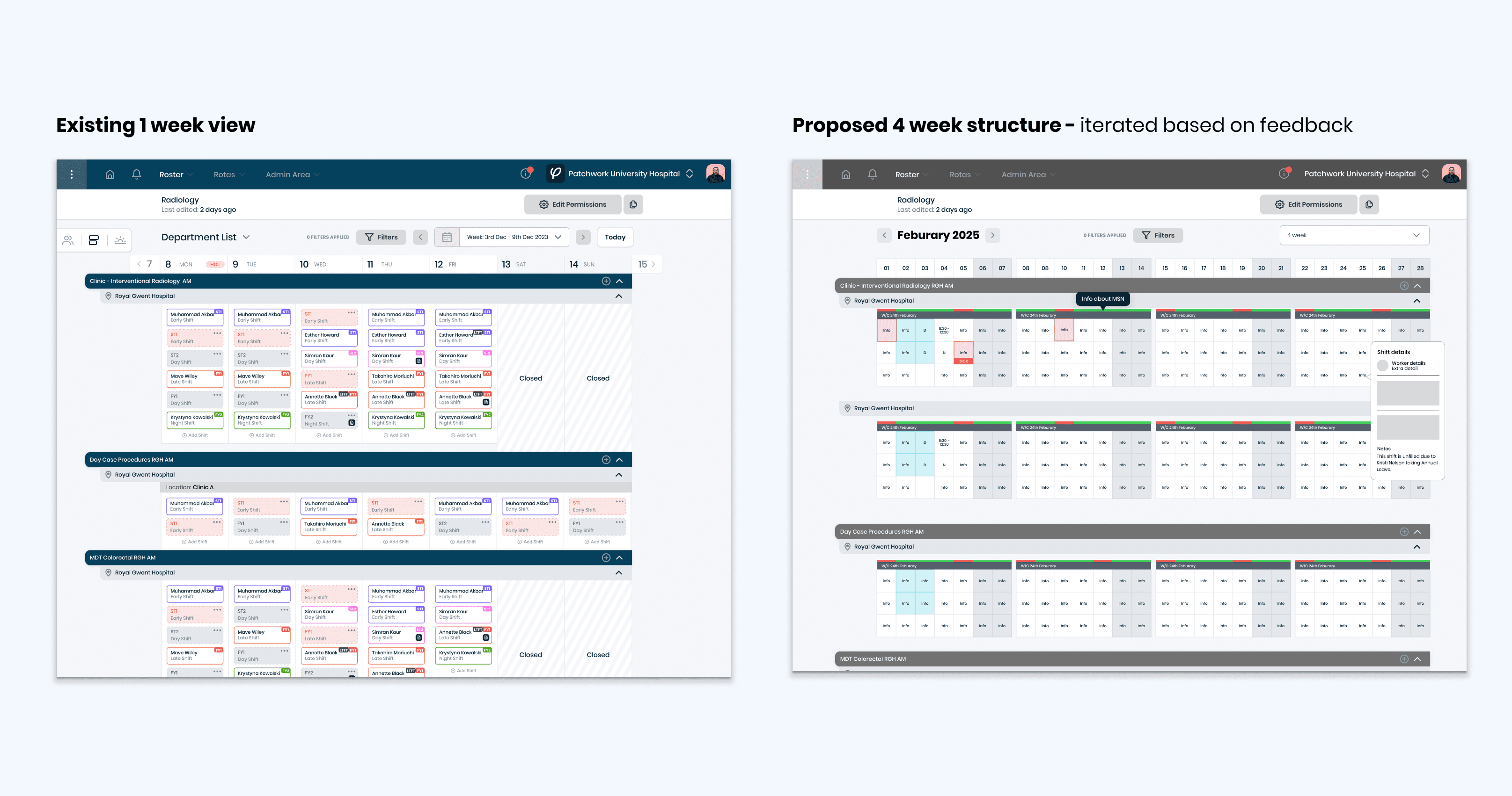
Despite its importance, the roster view had become a blocker. It only supported a single-week display, offered no way to see across departments, and lacked the flexibility needed to adapt to different trust setups.
Some users were screenshotting the view and stitching it together in PowerPoint. Others were duplicating rosters in spreadsheets just to make basic staffing decisions. These weren’t edge cases, this was the default way of working for multiple teams across several trusts.
Several go-lives had been paused because the system couldn’t support how departments like Anaesthetics, ED, or Paediatrics actually planned. Trusts were pushing back in contract negotiations. NHSIE compliance was at risk. This wasn’t a minor UX clean-up, it was a hard reset on the most used part of the product.
Deep discovery across multiple departments
I started with focused discovery to understand where the real friction was. I ran five in-depth interviews across multiple trusts and job roles, analysed feedback trackers from six separate accounts, reviewed product analytics and session replays, and mapped this against NHSIE spec documents and previous PRDs.
To synthesise the variation across users, I facilitated a persona-building workshop to align teams around the needs of rota coordinators, service leads, workforce planners, and execs. Each role had distinct priorities, planning horizons, and mental models.
Just as importantly, each trust did things differently. Some grouped staffing by activities. Others worked loosely in AM and PM blocks. Some planned six weeks out by default. Others worked week to week, but needed visibility for leave requests and on-call planning.
This wasn’t a case of designing one view for everyone. It was about designing a flexible surface that could support wildly different planning behaviours without adding overhead.

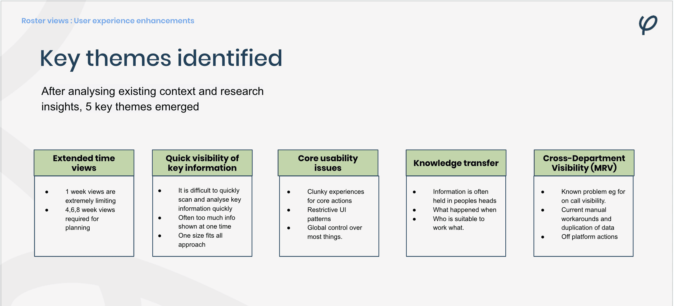
Addressing the most critical pain points
Multi-week visibility for planning
The one-week roster view was universally misaligned with departmental workflows. Across all roles, users needed to see 4–6 weeks ahead to plan leave, allocate resources, anticipate on-call demands, and address staffing gaps before they became urgent.
Control over information
Participants described the roster as “noisy but uninformative.” All data was presented at once, regardless of role or context, making it hard to focus on what mattered. Different roles needed different levels of detail, from high-level coverage patterns to specific clinician availability.
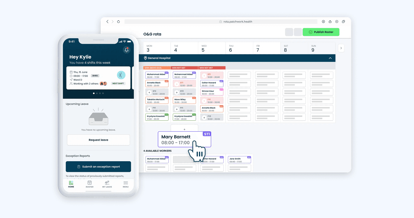
Task efficiency under pressure
Rota coordinators and managers often worked under significant time pressure. They needed to complete changes quickly, without navigating away from their main view or switching between multiple documents and systems.
Readiness for organisational scale
While most users worked within a single roster, there was a clear emerging need for multi-roster visibility at senior levels. This would allow cross-department planning, service-level oversight, and trust-wide workforce management, particularly relevant for site executives and divisional managers.
Prioritising for impact and business value
Out of the five identified clear opportunity areas, each had merit, however one stood out as the most impactful: enabling 4- and 6-week roster views.
Research made it clear that this wasn’t just a “nice to have”, it was a critical blocker to adoption. Across multiple roles and seniority levels, the inability to see further ahead limited planning, reduced the product’s value, and kept some departments relying on manual workarounds. In particular, senior managers and site executives needed a broader view to anticipate gaps, rebalance staffing, and address issues before they escalated.
By prioritising this change, we could unlock new use cases for the product, address long-standing frustrations, and remove a major barrier to wider organisational adoption. This focus provided a clear north star for the design and delivery work that followed.
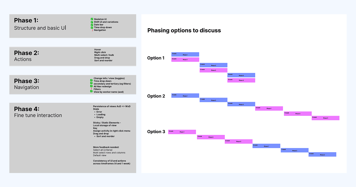
Structured delivery in focused phases
After facilitating opportunity refinement sessions, I broke the work into four clear delivery phases. This let us ship real value early and validate direction without blocking engineering delivery.
Phase 1: Core layout
New base structure, simplified UI logic, and persistent date range controls.
Phase 2: Interactions
Inline editing, hover states, right-click menus, and better access to shift-level data.
Phase 3: Navigation and filtering
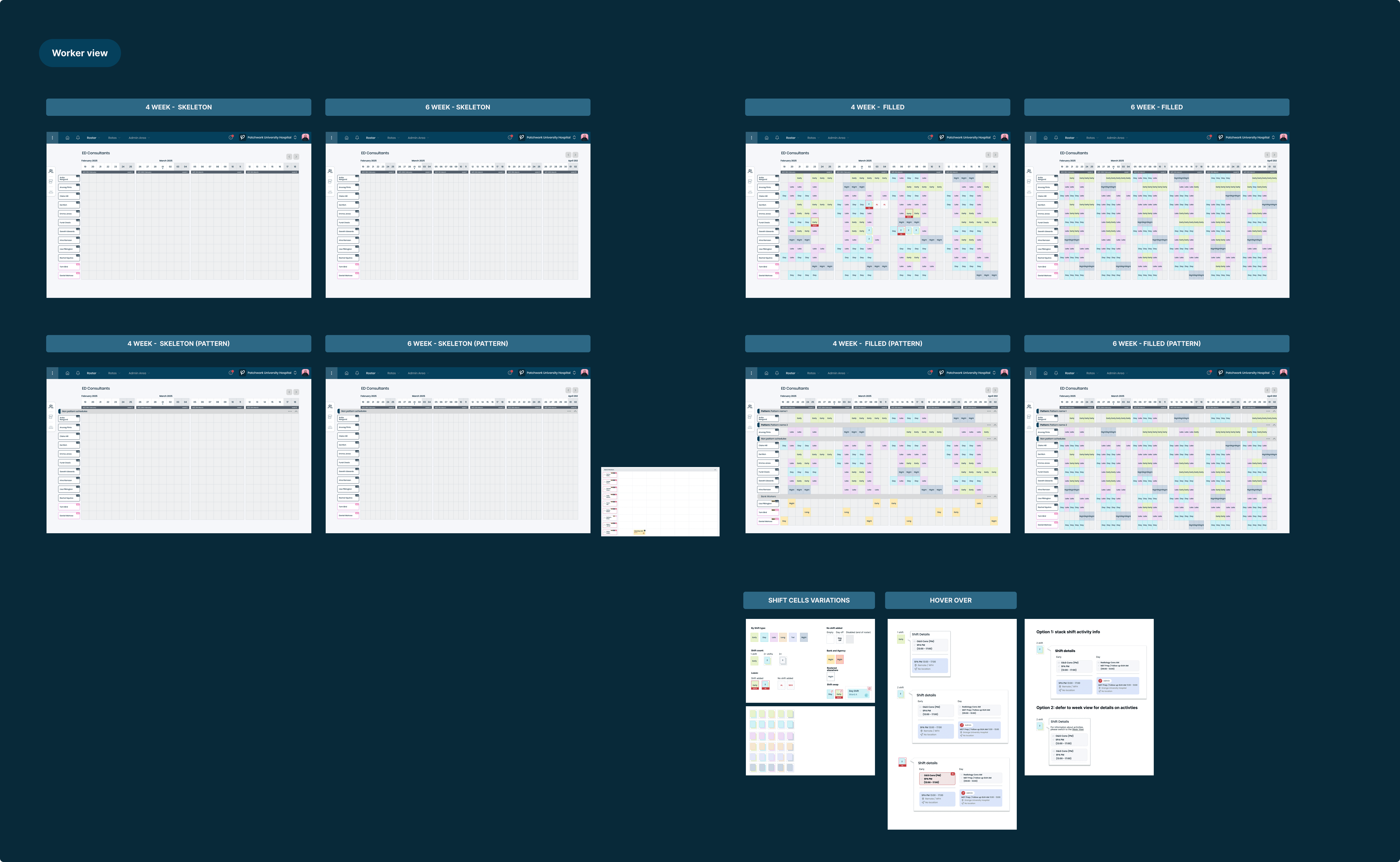
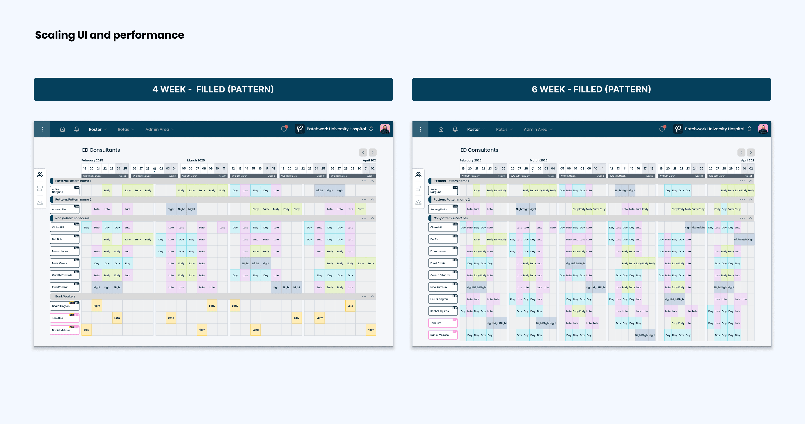
4 and 6-week views, toggle between worker and shift-type views, filters, and week number overlays.
Phase 4: Enhancements and scaling
Sticky headers, saved view states, key staff flagging, and performance improvements for high-volume rosters.
Testing and validation throughout
I tested early and often. Before any build work started, I ran concept walkthroughs and mid-fidelity prototype tests with live data and real user workflows. This surfaced important decisions early, including the shift from activity-based structuring to AM/PM blocks, which better matched how departments were assessing coverage.
As each phase shipped, I worked closely with users during pilot rollouts. They tested with real rosters, in real workflows, and provided targeted feedback that further shaped the following phases. This gave the project momentum, improved trust in the work, and allowed us to adapt without slowing delivery.
Performance designed in, not bolted on
Rendering six weeks of staffing data in a single view introduced significant performance risk. I worked closely with engineering to spike load handling strategies early. We explored data chunking, lazy loading, and interaction-aware rendering patterns. These changes meant we shipped a fully functional multi-week view with no measurable lag compared to the original one-week version.
Personal retro
This wasn’t a high-gloss redesign. It was a foundational rebuild that turned a fragmented, reactive feature into a scalable, flexible core surface.
It enabled trusts to resume onboarding. It gave rota teams back time. And it allowed senior stakeholders to finally see the system as a viable long-term solution, not a stopgap tool.
One trust saw a 16 percent increase in usage of the new multi-week views within the first month. Others quickly adopted the new views as standard for leave planning and rota forecasting.
The bigger outcome, though, was a shift in mindset. Once users had a planning surface that worked, they started asking better questions. They pushed for forecasting, shift suitability logic, and better coordination between departments. That pressure helped shape the next phase of our product roadmap with much more clarity.
For me, this project wasn’t about visual design. It was about helping the product grow up. We moved from barely meeting expectations to having a solid, extensible foundation, and the credibility to build on it.